
The Ripple Narratives brand
Our name is our idea. A story, told well, moves outward from the people at its centre and carries further than its size. Every part of our identity is built to say that, from the shape of the mark to the colours inside it.
Our role Brand strategy, identity, guidelines, website design and build, photography, and every application
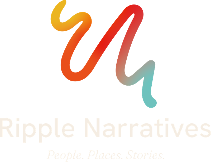
The meaning in the mark
A mark has to be simple enough to remember at a glance and deep enough to hold a story. Ours is a single hand-drawn line in four colours. Look at it long enough and you start to see more in it.
A ripple
Drop a stone in still water and the rings move outward. That is what a story told well does. It starts with one person and carries further than its size.
A river from above
Look down on Country from the air and the rivers wind like our line. Water connects everything we film, from the gorges of the Pilbara to the coast we call home.
A songline
Stories travel across Country, carried from one place and one person to the next. Our line follows that path: one continuous journey with no break in it.
A serpent
A pinched tail and a flared head give the line a living form, a shape that runs through many First Nations stories of water and Country.
Tail to head
Every story has a beginning and a direction. Ours begins at the fine point of the tail and moves forward through the head, always outward and never back.
What it adds up to
Waves, water, Country, journey and story, in one stroke. It is a reminder of what we are here to do: make work that resonates and keeps moving outward from the people in it.
Colours of Country
The four colours in our mark come from the elements we work among. They always travel in the same order, from the sun to the water, the direction a story moves.
Yellow
#ECB521
The sun, and the warmth that brings people together.
Orange
#E9501B
Fire and its embers, the place stories have always been shared.
Red
#E42318
Red earth, like the ground of the Pilbara, where so much of our work has been made.
Teal
#6EC3BE
Water, and in particular the turquoise seas of lutruwita and tayaritja, home Country of our co-founder Luke Gemmill.
Two grounds carry everything else: a warm cream (#F5EDE3) and a deep ink (#17130F). They let the colour do its work in small, deliberate doses.
Structured, and still organic
Our headline face is Fraunces: carefully built letters with soft, slightly irregular edges, the way a hand-drawn line has character a ruled one does not. It sets our tagline, the three words at the heart of everything we do.
People. Places. Stories.
Everything you read sits in Hanken Grotesk, a clean, open sans serif that stays clear at every size, on a phone screen or a printed proposal.
Where the brand lives
The colour field
A grainy wash of the four colours, generated from a fixed recipe and live on this website, where it warms under your cursor.
The Ripple line
The mark’s language stretched across a page: one continuous line that draws itself above every Start a project section.
Everywhere we show up
This website, our brand guidelines, business cards, email signatures, proposals, social media and the shirts on our backs, all speaking the same language.
Inside the guidelines
Every brand we build ships with a guidelines book. Here are fourteen pages from ours. Tap a page to see it full size.
Want a brand with a story in it?
We build identities the way we make films: we start with your people and your place, and find the story that carries.